Visualizing neural network metrics with TensorBoard
We finish our port of the neural networks model to Keras and TensorFlow by incorporating TensorBoard into the Colab notebook.
The biggest challenge in porting the PyTorch model to Keras was the difference between sparse-categorical-cross-entropy loss (Keras) and cross-entropy (PyTorch). We believe that the debugging process would have been faster had we incorporated TensorBoard into the Colab notebook (1) and plotted the loss as a function of the number of epochs. The plots would have shown the accuracy plateauing below 50% for many combinations of hyper-parameters and network designs. Perhaps the plateauing would have inspired a critical inspection of the Keras documentation earlier in the network development process.
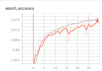
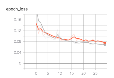
Having learned from the debugging experience we have incorporated TensorBoard (2) into the notebook. We show the accuracy and loss plots to demonstrate below. The gray curves are for the training dataset, and the orange curves are for the validation dataset. Both accuracy and loss are re-calculated and plotted at each epoch.
Invoking TensorBoard was straightforward, requiring only a few lines of code from the example in (2). Perhaps, this is another (small) reason to favor Keras + TensorFlow over PyTorch.
Note: The charts have not been saved in (1) to keep the file size small. Opening the file in Colab and running all the cells recreates the charts.